What Makes a Good Author Logo? (Hint: It’s Not What You Think)
Filed in: Authors, Brand Design, Featured — June 25, 2025

back to blog
Let me say this louder for the folks in the back:
Your author logo doesn’t have to be complicated, fancy, or dripping in symbolism to be good.
It just has to mean something. And preferably, that “something” should actually connect to your brand and reflect your voice as a writer.
There’s this idea floating around—especially in creative and literary circles—that your logo needs to say everything about you or your business. But when you try to pack too much into a single graphic? You end up with clutter. Confusion. And worst of all…a logo that doesn’t actually do its job.
Because here’s the thing: your logo isn’t just decoration. It’s a visual shortcut to the feeling your stories give people. Whether you’re self-published, traditionally published, or building your brand between book launches, your logo is often the first taste of your author identity a reader (or publisher, or agent) will see.
So what does make a good author logo? Let’s break it down—with some behind-the-scenes of how I built my own.
A Good Author Logo Starts with Strategy, Not Style 🧠
Before you ever open Canva or book a designer (like me 😉), the foundation of your logo should come from your brand core. That means asking:
- Who are you here for?
- What do you want to be known for?
- What’s the vibe you want people to feel when they land on your site or scroll your feed?
Your logo isn’t supposed to capture every nuance of your brand. It’s supposed to distill it—simplify it into something recognizable, memorable, and meaningful.
You want it to represent you, not explain you. It should set a tone—not explain your entire backlist.
How I Designed My Own Brand as a Literary-Focused Designer 📚
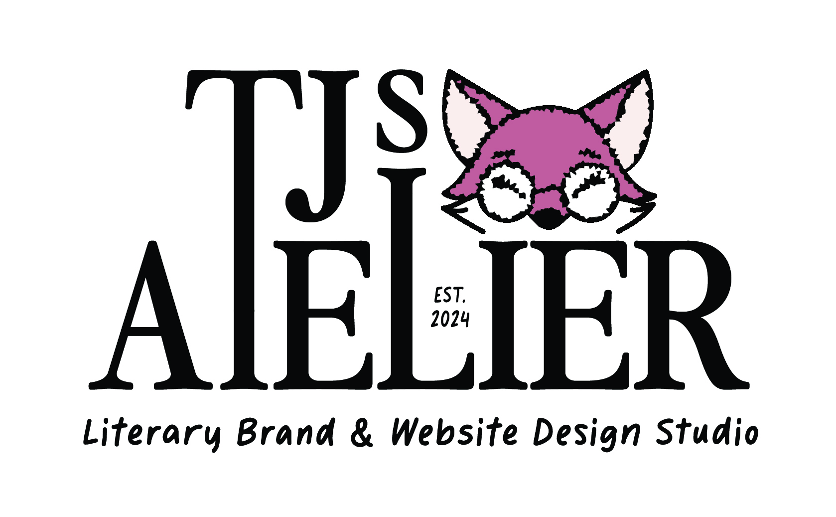
My design studio, TJ’s Atelier, was built for authors and editors—so the brand had to reflect that bookish energy. But I didn’t try to cram every literary reference or design trend into one tiny logo.
My brand as whole has layers. We’re talking:
- Cozy ‘90s academia
- Early 2000s millennial energy
- Nostalgic Y2K tech & media vibes
- A literary lean (because, hi, authors and editors are my people)
Now, do you see all of that in my new logos? Not even close. And that’s on purpose. Here’s what I did include:
- Tall, elongated T and L → representing library book stacks
- Handwritten font → to bring in those cozy, friendly, notebook-in-a-messenger-bag feels
- Pixelated fox mascot → a nod to grainy Y2K computer icons and a literary reference (think The Fox and the Hound, Robin Hood, etc.)

And that’s enough. That tells you who I am, who I’m here for, and what it might feel like to work with me—all without cramming a Polaroid, an AOL away message, and a Coldplay lyric into the design.
That combination says: this is a bookish, tech-savvy, creative space that feels nostalgic and personal. No quill pens or generic feather icons in sight.
So…Does Your Logo Work? A Quick Gut Check for Authors 🔍
Not sure if your logo is actually doing its job? Ask yourself:
- Does it reflect your brand’s personality or tone?
- Does it reflect your genre or reader promise?
- Can you explain why each element is there?
- Would your audience recognize your brand if the name was removed?
- Could a reader pick it out of a lineup and say “Yep, that feels like [your name]”?
- Does it still work in black & white or at small sizes (like a favicon or business card)?
- Does it work on your book site, your email signature, and the back of a bookmark?
- Would your ideal reader trust you based on your visual brand alone?
- Does it feel timeless enough to last a few years—or is it based on a passing design trend?
- Do you like it—or are you settling for “good enough”?
If your answer is “meh” or “I don’t know” to more than one of those, it might be time to revisit your brand foundation before touching the visuals again.
Logos Don’t Need to Say Everything—Just the Right Things ✨
You’re allowed to let your brand experience carry the rest of the story.
Your content, your tone, the way your site feels, the references you make—all of that fills in the blanks. Your logo is just one (very visible) piece of the puzzle.
I’ve seen plenty authors with logos that were beautiful but misaligned. One author had this dreamy, whimsical handwritten logo that looked like it belonged on a children’s book cover—but she wrote high-stakes literary thrillers. Another had a script font so decorative you couldn’t even read her name at small sizes.
In both cases, I questioned the core of their brand: What were they trying to evoke? Who were they trying to connect with? What did their work feel like?
That’s where they should build from.
Want an Author Logo That Works as Hard as You Do? 🫱🏾🫲🏾
Whether you’re building an author platform, launching a personal brand, or tired of logos that feel more Etsy than editorial, I’ve got you.
Together, we’ll find the key themes in your author identity. When we work together on your brand, I’ll walk you through the pieces that matter most—your audience, your personality, your goals—and we’ll translate that into visuals that feel like you, sound like you, and set you apart.
Because your logo doesn’t need to explain your whole plot.
It just needs to represent your story—visually.
So if you’re ready to build a brand (and a logo) that makes people feel like they get you instantly?
Well, I’m ready when you are!
With light,
Ty 🤎
Leave a Reply